Charts in Math: Types, Uses, Interpretation, and Activities
 written by Azhar Ejaz
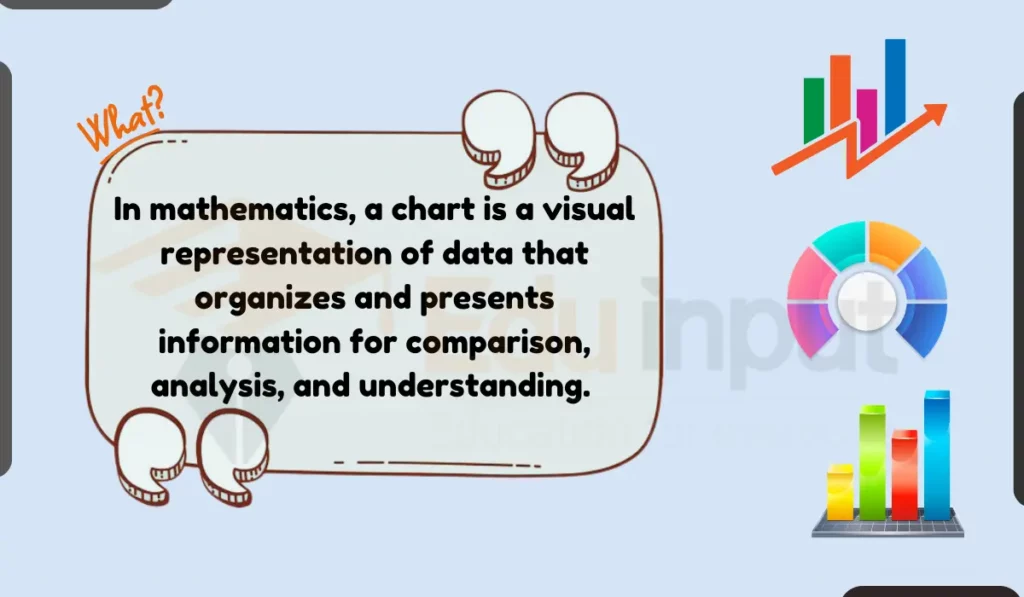
In mathematics, a chart is a visual representation of data that organizes and presents information for comparison, analysis, and understanding. Unlike graphs, which primarily focus on visualizing trends and relationships between variables, charts emphasize organization and comparison of data points.
How Charts Differ from Graphs?
| Feature | Chart | Graph |
|---|---|---|
| Primary Focus | Organize and present data for comparison or analysis. | Visualize trends and relationships between variables. |
| Data Representation | Bars, pie slices, histograms, flowcharts, Venn diagrams. | Lines, curves, points. |
| Common Uses | Comparing categories, showing proportions, illustrating processes, analyzing data distribution. | Visualizing trends over time, identifying correlations, analyzing relationships. |
Activity to Understand What is Chart
For kids:
Grab your favorite candy collection and let’s create your own charts.
- Sort your candy by color, flavor, or type.
- Draw a chart: bars for comparing amounts, pie for showing parts.
- Count and label: what patterns do you see?
- Share your chart with friends, explain what you learned!
For older students
- Choose data you love: movies, sports, weather, anything!
- Organize and count: categories, values, let’s get specific!
- Chart it up: bars, lines, pie slices, pick the best fit.
- Analyze and explain: trends, patterns, what did you find?
- Share your chart with the class, be a data detective.
Types of Charts Used in Math
Here are different types of charts that are used in math:
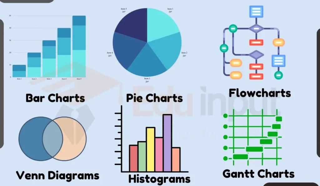
1: Bar Charts
Imagine a race where the bars are the runners, and their height shows who’s ahead. These charts are perfect for comparing different things, like ice cream flavors or your test scores.
Bar charts use rectangular bars to show different amounts or compare between things. The bars can be vertical or horizontal. The height or length of each bar shows the value or size of each thing.
Bar charts are good for comparing a few numbers or categories. They are used in math classes to make problems about data more fun and visual. Newspapers and magazines also use bar charts to show information like how many apples were sold each month or the average test score for different schools.
2: Line Charts
A line chart is a graphical representation that uses points connected by straight lines to depict trends and relationships between data points. It is one of the most common and versatile types of graphs.
These charts are great for tracking things like plant growth or the temperature throughout the day.
Line charts are primarily used to show trends and changes over time or another continuous variable. They are ideal for visualizing how a particular value evolves or how two variables are related.
( a line chart falls under the broader category of charts due to its focus on organizing data (connecting data points) and presenting it in a way that helps visualize trends and relationships )
3: Pie Charts
Think of a delicious pizza divided into slices. Each slice represents a part of a whole, like the percentage of students who love different subjects.
Pie Charts divide a whole circle into pieces to show the fraction or percent for different parts. Bigger slices of the pie show larger amounts.
Pie charts clearly display parts of a whole, like what percent of students have brown, blond, black, or red hair. They also visually break down the details within broader categories, such as the flavor choices people voted for.
4: Flowcharts
Flowcharts display a series of steps with boxes, arrows and lines. They explain the order and decisions in a process from start to finish. The arrows connect each box, showing what comes next and allowing yes/no options or possibilities.
Flowcharts clarify complicated procedures like computer programs, science experiments, assembly instructions, organizational structure and more. Simple shapes and arrows make the sequence of events easy to follow.
5. Venn Diagrams
Venn diagrams use overlapping circles to organize things into groups, showing similarities and differences. The area where circles overlap holds things the groups have in common. But each circle also has its own area for unique elements.
Venn diagrams compare and contrast categories or sets of numbers and objects. They help sort things that are alike or different. Common uses involve math concepts like primes, odds and evens or classifications like mammals vs. reptiles. The circles clearly show what qualities belong together or stand apart.
6. Histograms
Histograms are charts made of bars that show the distribution of numerical data. The bars group numbers into ranges, with the bar height showing how many items fit in that range. Wider bars mean more data points within a value range.
Histograms provide an overview of a data set to see where numbers cluster. They reveal if data is skewed high or low overall. Common uses include test score distribution, income ranges, or ages of people in a group. The bars summarize the spread of measurements.
7. Gantt Charts
Gantt charts use horizontal bars against a calendar style grid to map out a project schedule. Each bar represents a task in the project, showing when it begins and ends. Bars can overlap to show multiple things happening at once.
Gantt charts keep projects organized to see what should happen when and how long each step takes. They help schedule lots of moving parts, clarifying order and connections between activities. Project managers and software developers commonly use Gantt charts for coordination and planning.
How to Interpret Charts?
Interpreting different types of charts requires understanding their purpose and key features.
All you need to notice is Are things going up, down, or staying the same? Are some categories bigger than others?
Here’s how to interpret common chart types.
1: Interpreting Bar Chart
- Purpose: Compare values across different categories.
- Interpretation: Look at the relative length of bars for each category. Longer bars indicate higher values. Analyze the difference in length to understand the magnitude of comparison.
- Example: Compare the number of students who like different sports in a class.
2: Interpreting Line Chart
- Purpose: Show trends and relationships over time or other continuous variables.
- Interpretation: Observe the direction and slope of the line to identify trends (increasing, decreasing, stable). Analyze the steepness of the slope to understand the rate of change.
- Example: Track the average temperature changes throughout the day.
3: Interpreting Pie Chart
- Purpose: Show the proportion of each category within a whole.
- Interpretation: Focus on the size of each slice relative to the entire pie. Larger slices represent larger proportions. Calculate percentages for each category if needed.
- Example: Show the distribution of students with different hair colors in a class.
4: Interpreting Flowchart
- Purpose: Illustrate the steps and decision-making process in a sequence.
- Interpretation: Follow the arrows to understand the flow of the process. Identify decision points and their corresponding outcomes. Analyze the overall sequence to grasp the logic behind the process.
- Example: Visualize the steps involved in solving a math equation.
5: Interpreting Venn Diagram
- Purpose: Organize objects into groups based on shared characteristics and highlight similarities and differences.
- Interpretation: Observe the shared space within the overlapping circles to identify characteristics common to both groups. Analyze the unique areas of each circle to understand characteristics specific to each group.
- Example: Classify different shapes based on their properties, such as number of sides and angles.
6: Interpreting Histogram
- Purpose: Show the distribution of numerical data within intervals.
- Interpretation: Analyze the height and width of each bar to understand how data points are distributed. Identify clusters and potential skewness based on the shape of the histogram.
- Example: Analyze the distribution of test scores in a class.
You can analyze skewness easily with our Skewness Calculator.
7: Interpreting Gantt Chart
- Purpose: Visualize project schedules, task durations, and dependencies.
- Interpretation: Identify the starting and ending dates for each task based on the position and length of the bars. Analyze the relationships between tasks by observing overlaps and dependencies.
- Example: Understand the project schedule for building a model airplane.
Leave a Reply