What Are Charts in MS Excel?-Types of Charts
 written by Sehrish Basharat
Charts are graphical representations of data from a worksheet that can help users quickly understand, compare, and find patterns and relationships. By seeing data in charts, it is easier to find trends and make better decisions.
Charts are a great way to represent data that is based on numbers. They can help us to easily understand, interpret, and analyze the data. This is especially useful when we are dealing with large amounts of data.
Microsoft Excel offers a wide variety of charts to choose from to best represent your data, as well as options to further customize and enhance the presentation of your chosen chart. Let’s get started learning more about charts in Microsoft Excel.
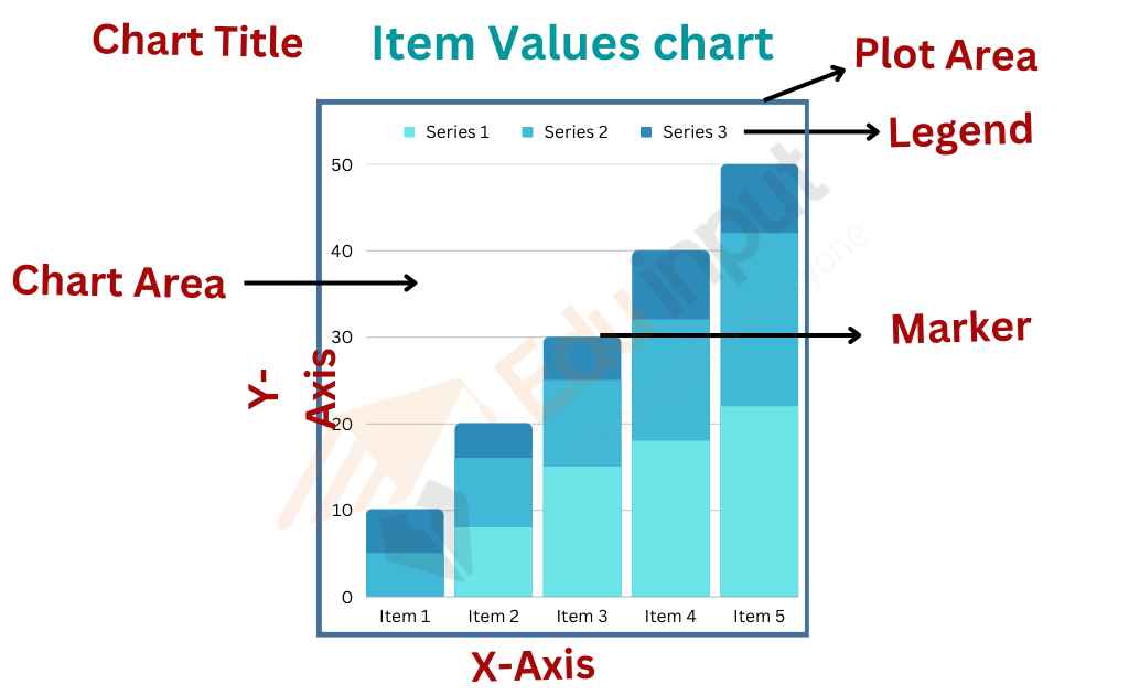
Elements of a Chart
Types of Charts
Excel supports a variety of charts that can be used to better visualize your data. Some of the different types of charts available are: –
- Column charts
- Bar charts
- Line charts
- Pie charts
- Doughnut charts
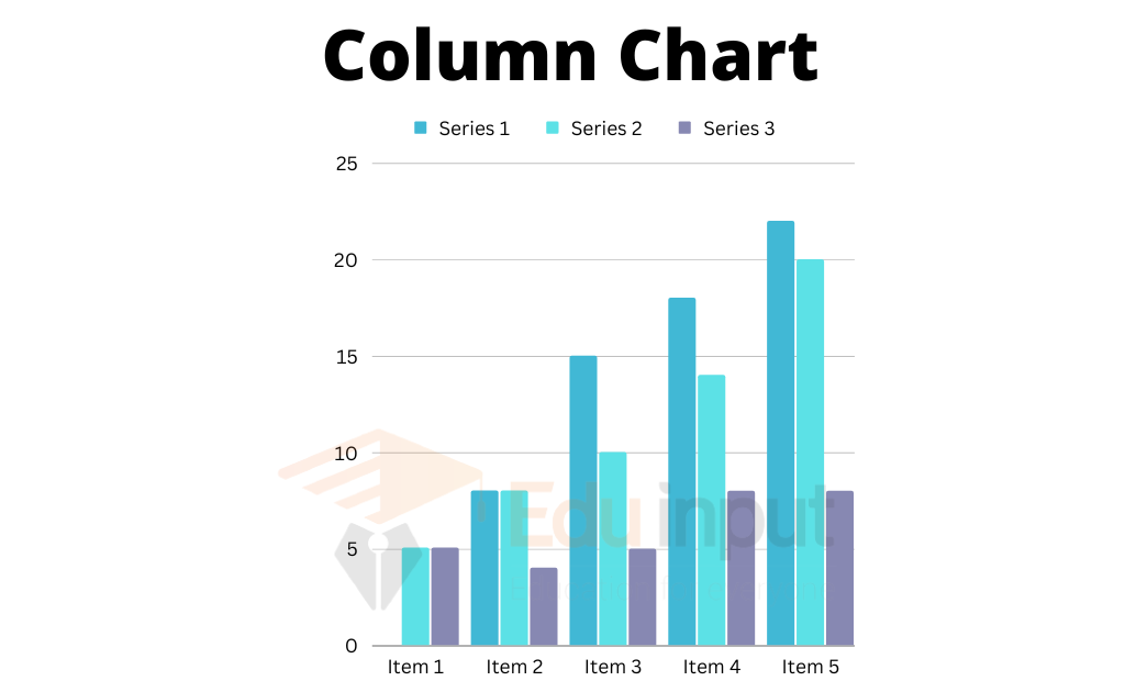
Column Chart
A column chart is used to represent comparisons between different data items or changes in the data trend over time.
In this chart, values are plotted on the y-axis (vertical axis) while categories are plotted on the x-axis (horizontal axis). Each bar in the graph represents the value of one item of data.
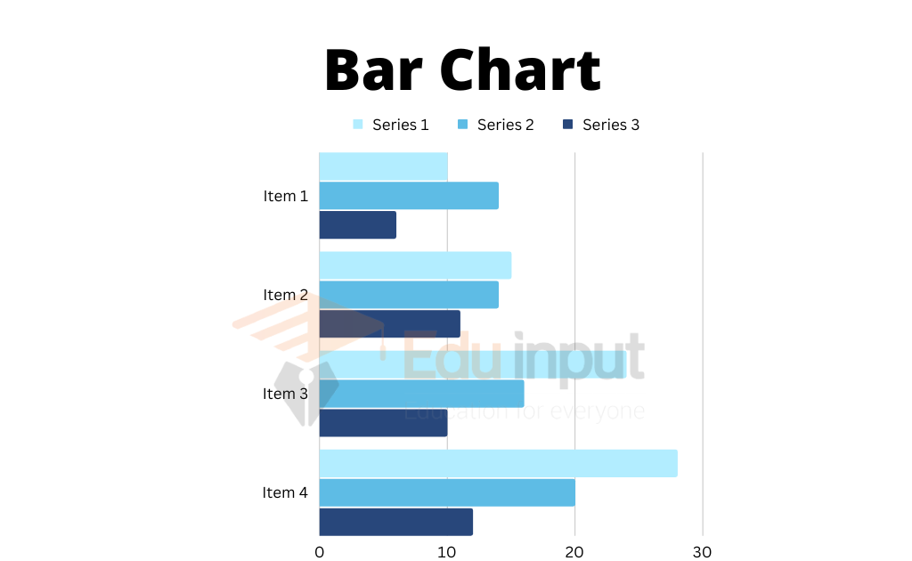
Bar chart
A bar chart is a data visualization tool that allows for quick comparisons between individual items using horizontal bars. Bar charts are similar to column charts, except that in a bar chart, values are represented on the horizontal axis while categories are represented on the vertical axis.
Pie Chart
The pie chart is a visual aid that is used to display data when there is only one data series. The chart is created in the shape of a circle and is then divided into sections, with each section representing a different quantity as a percentage of the whole. This type of chart can be helpful in illustrating the relationship of individual items to the sum of all items in the series.
For example, the pie chart in the figure below displays the percentage of favorite subjects.

Doughnut Chart
A doughnut chart is similar to a pie chart except that it can be used to plot more than one data series. Data is represented by rings, with each ring section displaying the contribution of an individual item to the total of all items in a particular series.
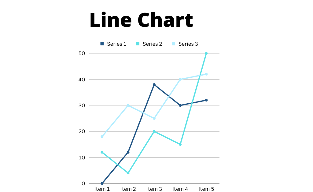
Line chart
A line chart uses connecting dots to show data trends over time. The line chart below visualizes the changes in the value of one item over time. For example, to check the trend in the different series of data as a line chart.
Related FAQs
What are charts in Excel?
In Microsoft Excel, charts are used to create a graphical depiction of data. This is done by representing the data with symbols like bars in a bar chart or lines in a line chart.
How many types of charts are in MS Excel?
· Column Chart
· Bar Chart
· Pie Chart
· Doughnut Chart
· Line Chart
What is the importance of charts?
Charts are a great way to compare multiple sets of data visually. They can help people better understand and remember information since most people understand a picture more quickly than blocks of text. A well-designed chart can help you make your point more effectively and add credibility to your presentation.
What are the parts of a chart?
· Chart area
· Plot area
· Data series
· Axes
· Titles
· Data labels
· Legend.

Leave a Reply